Social media content | November 2025 – January 2026
Problem Statement
The client wanted a logo that captures the essence of her social media presence. With plans to expand her content this year, she was looking for a logo that feels professional, versatile, and aligns with her growing brand.
Research
Mood Board
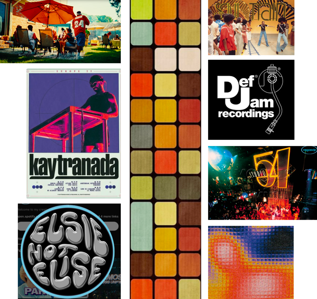
To really understand the vibe, I collaborated with the client to create a mood board.
Typography
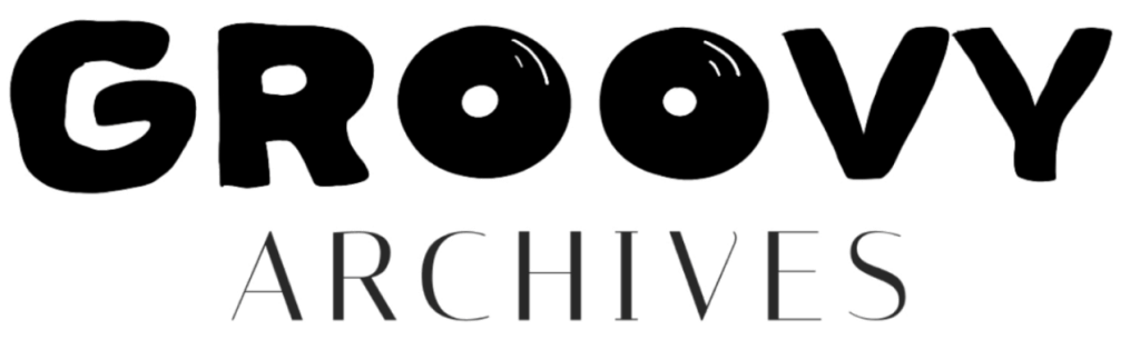
The typographic exploration spanned modern-retro influences and playful bubble lettering, reinforcing the brand’s expressive character.
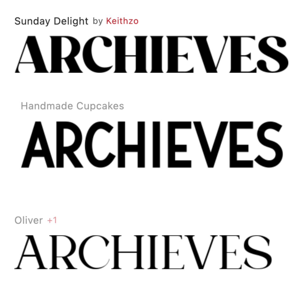

Fonts I found were Sunlight delight, Handmade Cupcakes, Oliver, and Super frog.
Ideation
Sketches
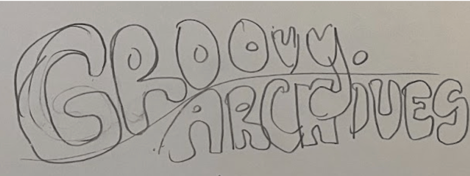
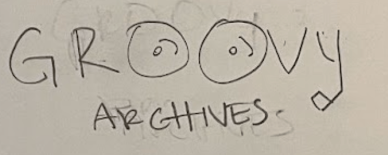
Using insights from the mood board and typographic exploration, I began sketching concepts through rapid one-minute iterations before moving on to the next idea.
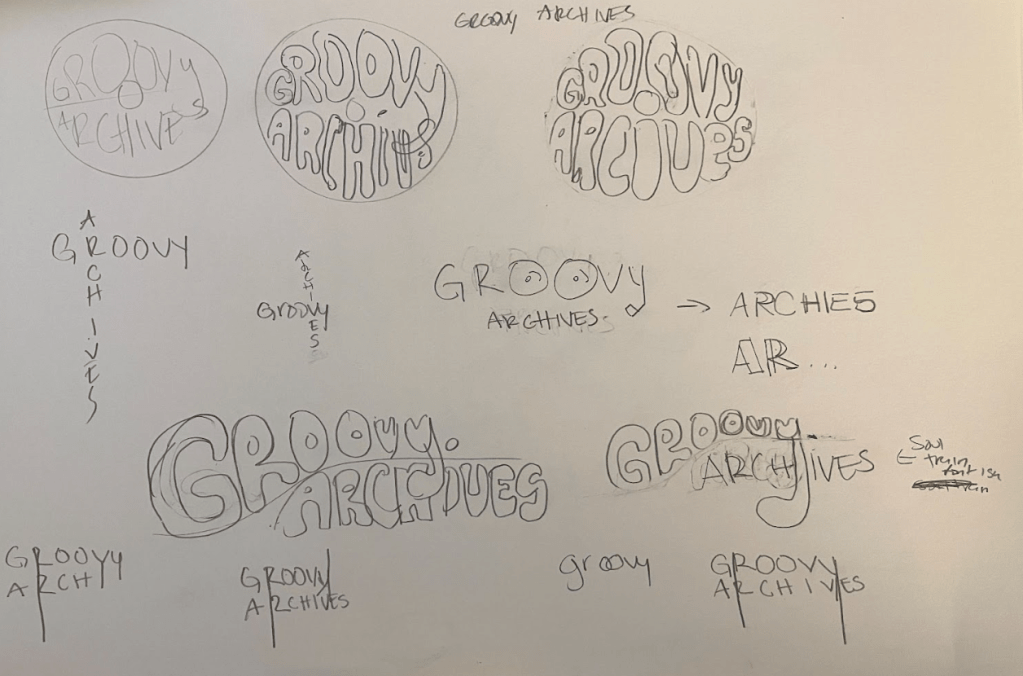
These designs stuck out to me.
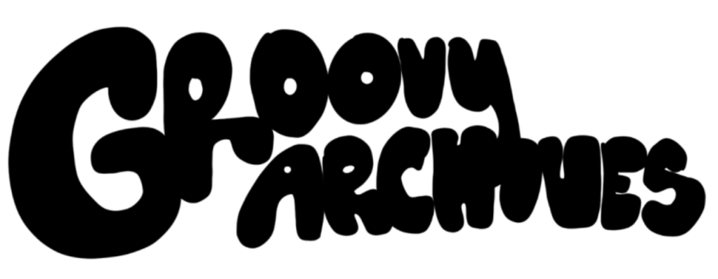
This design blends the energy of Soul Train aesthetics with playful bubble lettering.
The design’s motif is a turntable, emphasizing a retro music-inspired aesthetic

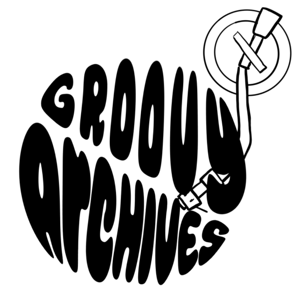
The design’s central motif is a vinyl record, reflecting a retro musical vibe.
Digital Concepts
With those three designs in mind, I used Procreate and Figma to make digital mockups to present to the client.
Final Design
First Concept
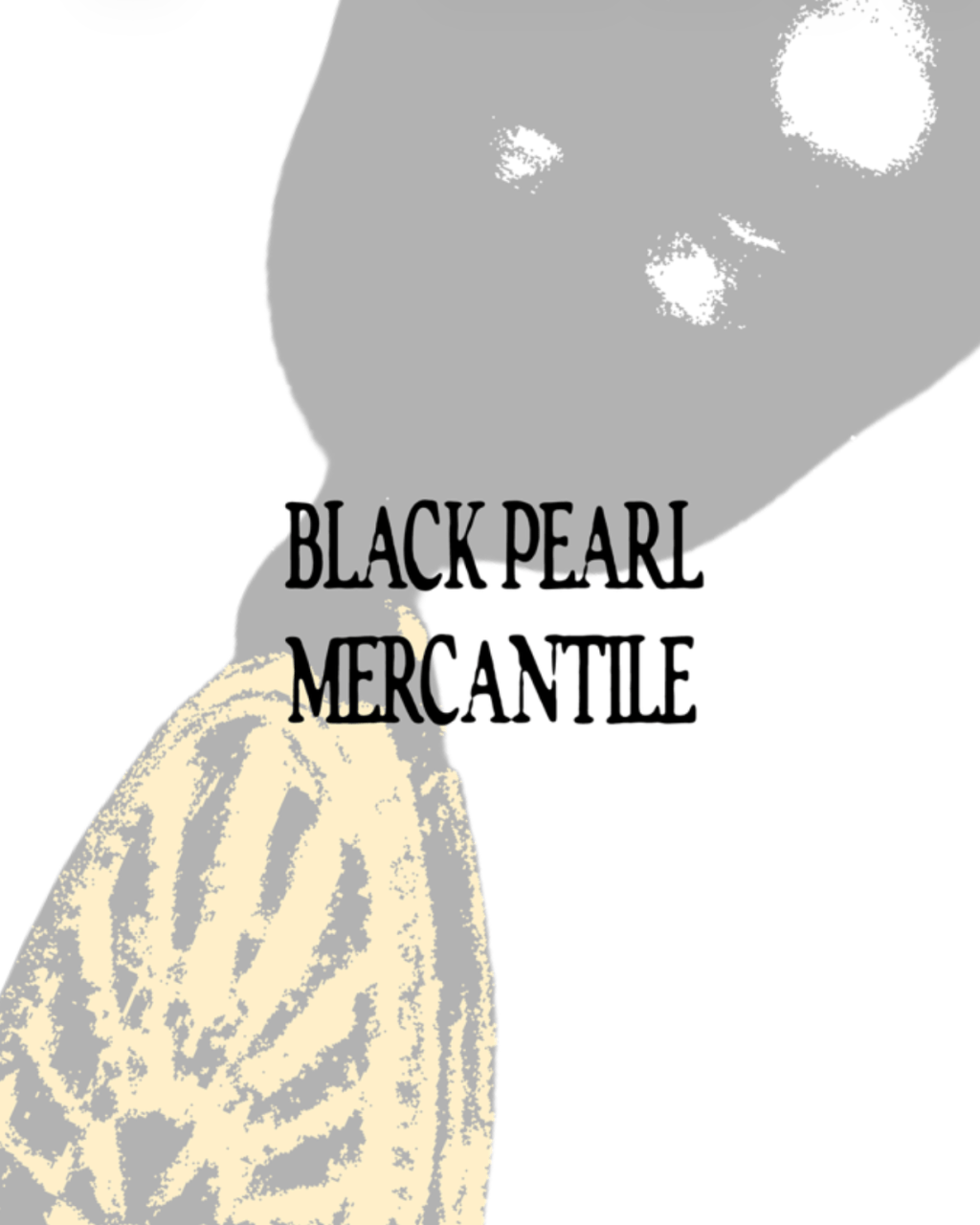
The client really liked the last design with the vinyl motif, and gave me ultimate creative control over the colors. Using Photoshop, I finalized these designs.
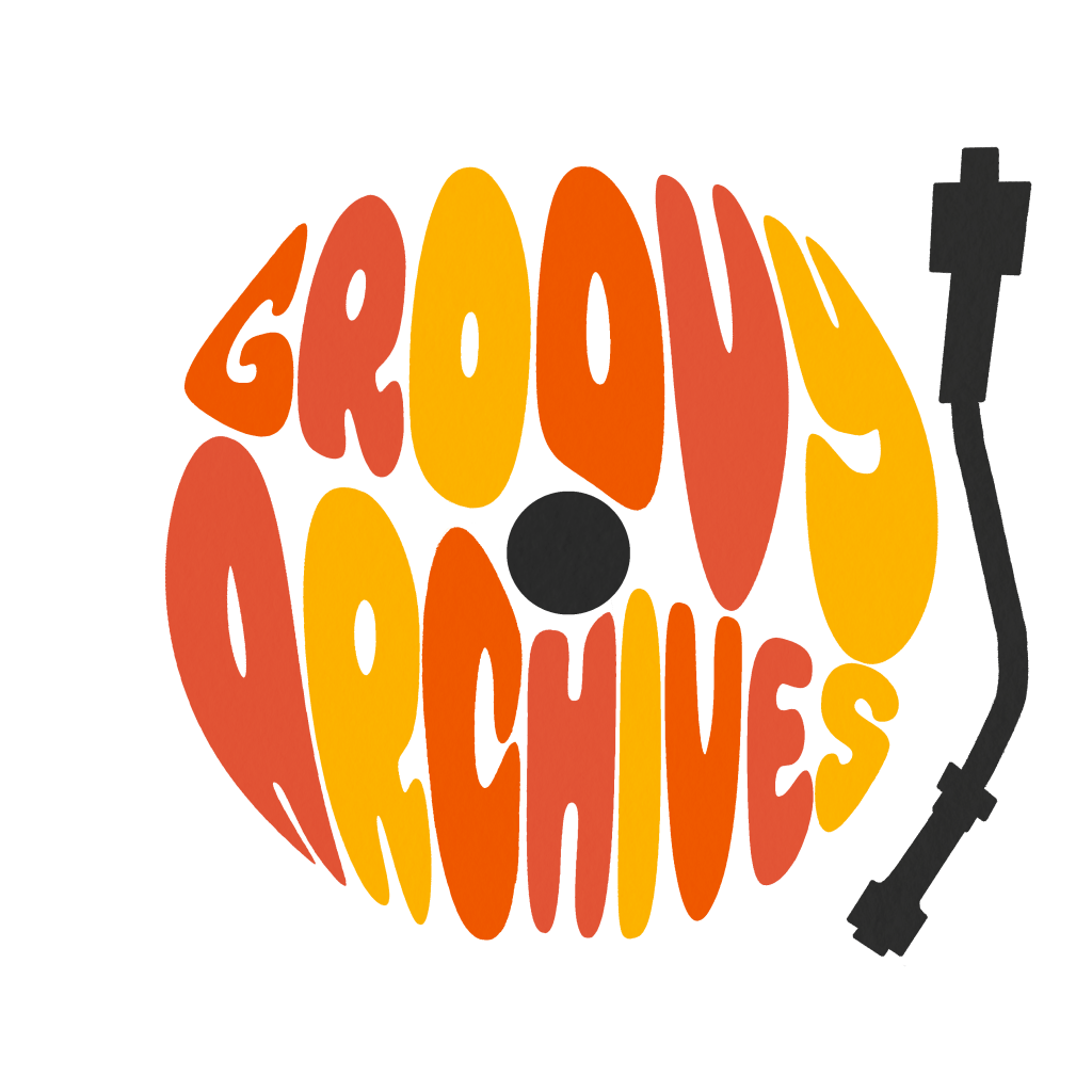
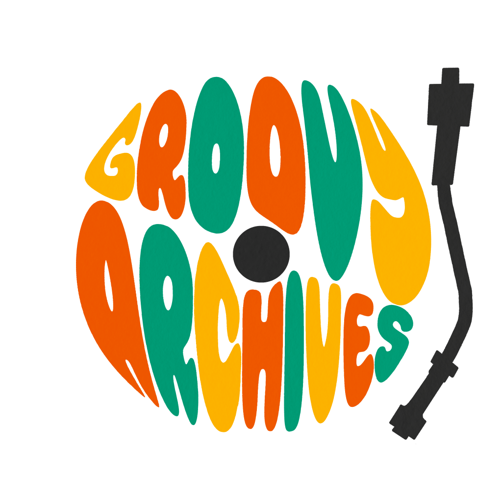
These logo variations provide flexibility across applications. The color palette draws from 1970s-inspired tones, warm, earthy, and sunlit. Creating an overall sense of joy and approachability.
The turntable arm was repositioned to the side to improve legibility. This adjustment also allows the client to remove the element entirely when greater flexibility is needed.
Second Concept
I wanted to try the glass/metallic look in from the mood board and came up with this concept.

The client loved this idea as well and approved of both concepts.
Reflection
Overall, this project went very smoothly. The mood board and typographic research provided a strong foundation, keeping visual decisions consistent throughout the process. Rapid sketching allowed me to explore multiple concepts quickly without getting attached to any single idea, ensuring that no valuable concepts were lost. This approach helped me create a flexible and cohesive design that truly captures the retro, playful spirit of the brand.